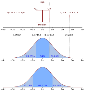
Box-and-Whiskers plot is a little bit more complex thing than the Candlesticks. Each box aggregates a set of values, and illustrates how exactly these values are distributed in their [min ... max] range. This picture (copied from Wikipedia) probably illustrates that the best way. Please refer to the actual article on Wikipedia to know more.
