Seasonality chart is a way to see how the asset was behaving in particular month. We've collected the data for years, so you may think of that as of statistics.
Simple Mode
In Simple mode (the default one) you can see every month is illustrated with a colored column and a label (i.e. ,"70% (+5%)"). Here's what this means.

Let's talk about May on a picture above. It's red, and its label reads "23% (-3.3%)". The fact that it's red is related directly to this "-3.3%" number, which is actually the "Average Change% for all Mays in given period" (this chart was built using 12 years of data). So from this chart you can say that in May, this stock had been dropping by -3.3% in average, for 12 years.
Green columns indicate the positive Change% values, red ones indicate the dropouts. The more intense is the color, the higher is the absolute value of a Change%.
There's one more number left here to explain: this "23% (-3.3%)". This is a fraction of all Mays (for 12 years) when this stock had positive change (so it was growing).
So here's a number of conclusions you could draw from this chart (it's AAU btw), to illustrate the idea:
- AAU was growing in March only in 23% of cases for 12 years
- AAU was growing in 54% of all Aprils, and average Change% was +8.3%
- April is a month when AAU user to grow much more frequent than in Mar, May or June
You also may see that AAU used to grow only in 23% of all Mays for 12 years. But what if you want to know what was happening all the other Mays ? Here's where you need the Advanced mode.
Advanced Mode
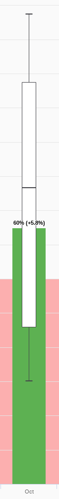
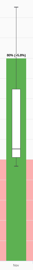
The Simple mode is nice, but actually it allows only for a sneak peek. If you want to dive into the real numbers, to see HOW exactly the numbers were distributed, you need to use the Advanced mode. This mode adds 3 new elements to the Simple chart:
- box-and-whiskers chart
- red area (area of negative Change% values)
- The new Y axis on the right, containing Change% values
Here's the Advanced chart for the same symbol as above.

You need to be familiar with box-and-whiskers concept in order to proceed.
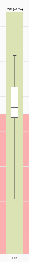
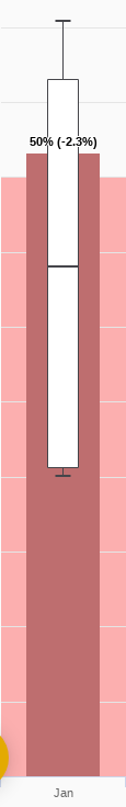
Box plot gives you a way to see how the Change values were actually distributed. Red area indicates the area of negative Change values for the boxes.
I.e., here's a number of conclusions you can draw from this chart:
- Max. Change% AAU ever had in March was +0.13%. Min Change% in March was -0.18%
- Max Change% in Aug was +1.28%, but it was rather a spike (since nearly all the body of a box is in the Red area).
- Dec used to be more interesting from a growth prospective than Jul, because the body of a box is larger (means that Change% were higher) and it has only a small part of it in the red area.
That's cool, but here are some more examples, which are rare findings (and thus are very valuable)